
It is a delicious irony that a brand named "Nothing" has delivered a software overhaul this substantial. Nothing OS 5.0, built on the foundations of Android 17, marks the exact moment the company stopped selling a "vibe" and started selling a high-utility ecosystem.
This update represents a fundamental shift from minimalist aesthetics to deep, functional intelligence. While the brand’s visual DNA remains, the transition from "Nothing" to "Everything" for power users brings both a radical democratization of software and a controversial thinning of the herd.
The Phone as a Dev Kit: Essential Apps and MCP Support
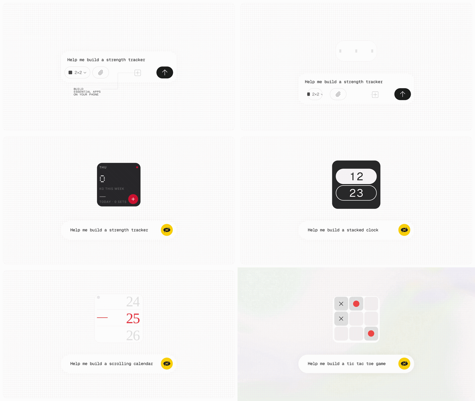
The "Essential Apps Builder" has graduated from a niche web experiment to a full-fledged system app. Users can now describe a tool in natural language, and the OS generates a functional widget or app directly on the home screen.
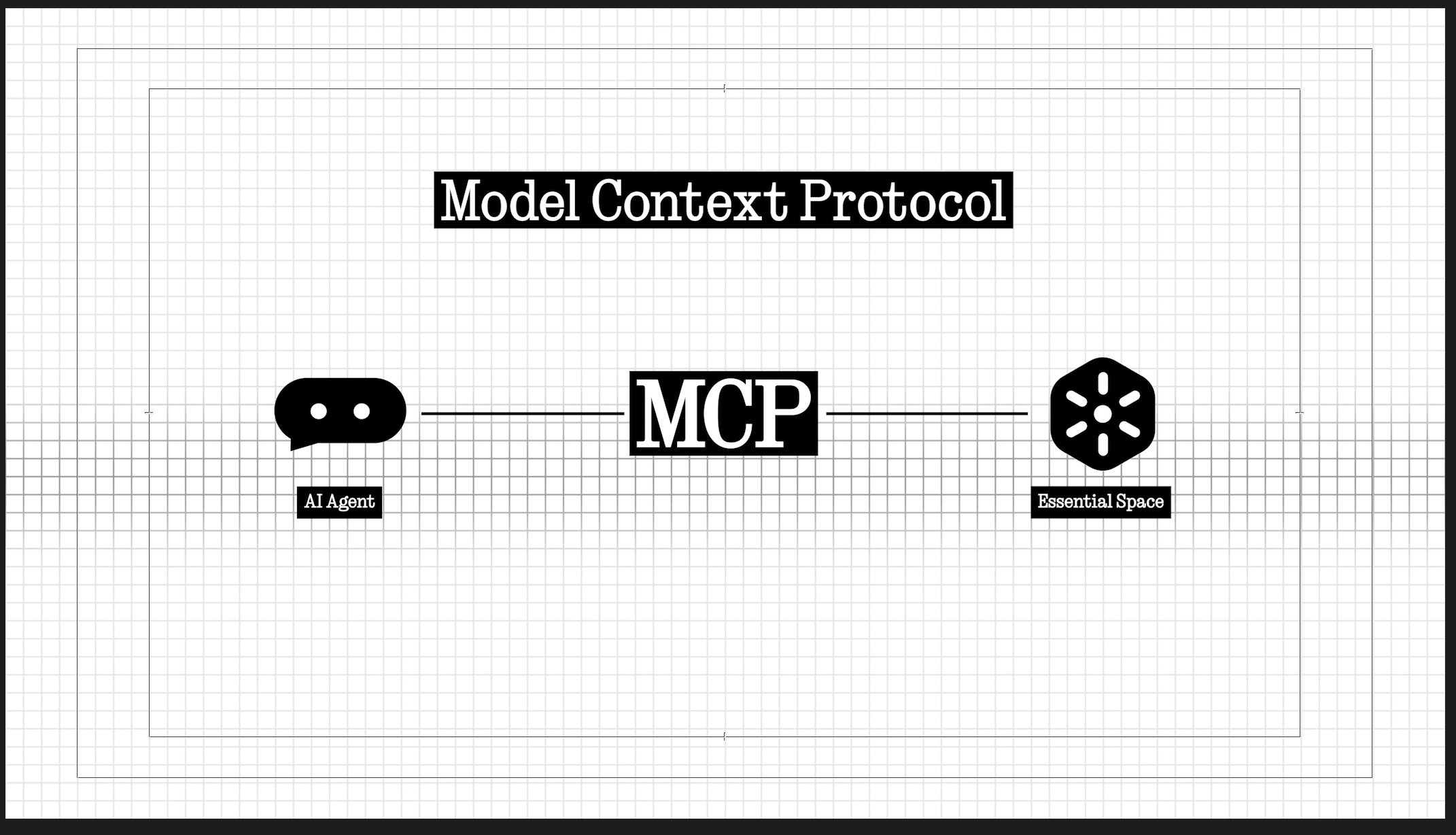
Beyond simple tools like metronomes or morning planners, the real "journalist" angle here is the inclusion of Model Context Protocol (MCP) support. This allows compatible AI platforms to read selected data from your Essential Space, turning your saved captures into a live knowledge base for your digital assistant.
Tearing Down the Garden Wall: Quick Share for iPhones
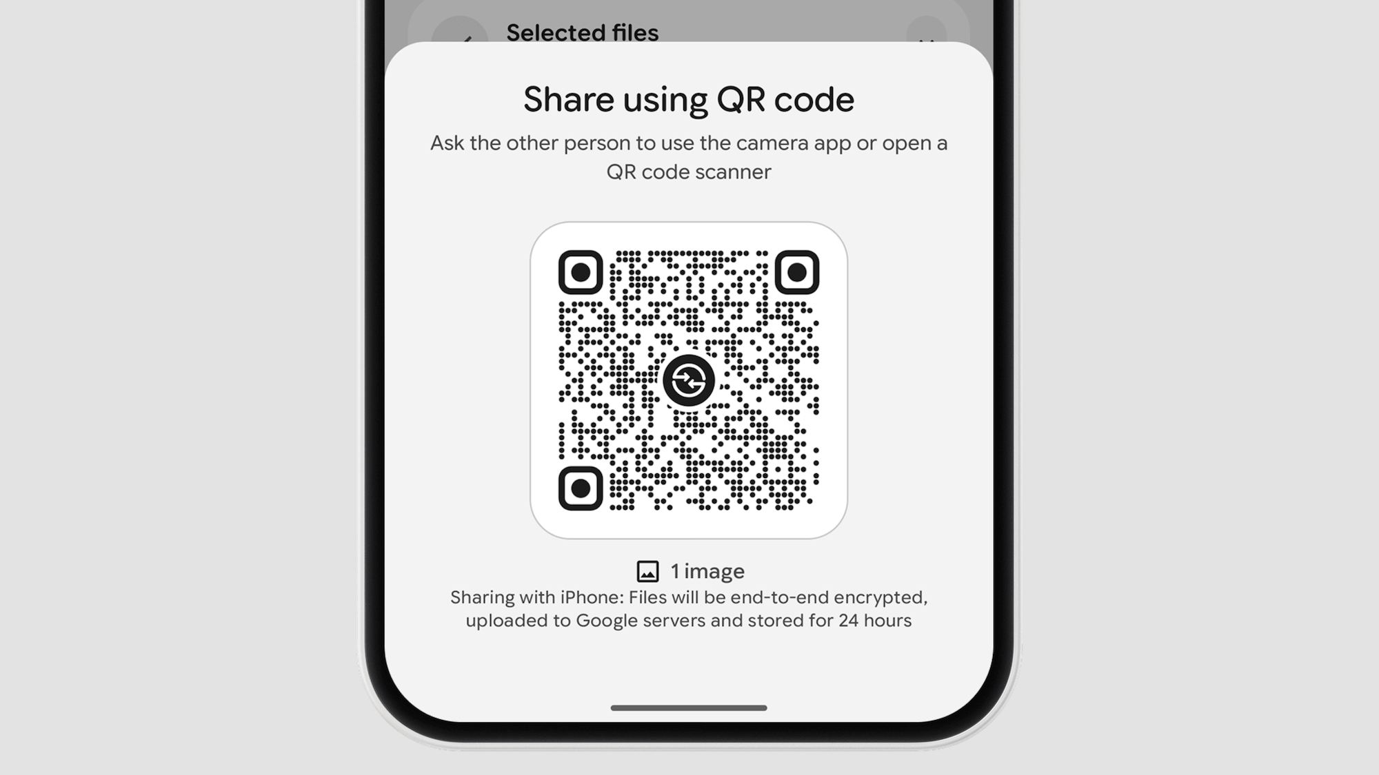
Nothing is finally addressing the friction of a multi-platform world with its "Enhanced Quick Share" implementation. By generating a secure QR code, users can share files with iPhones and other Android devices without requiring any third-party apps.
This is a masterclass in pragmatism over ecosystem locking. It acknowledges that even the most loyal Nothing enthusiast likely lives in a world of mixed devices, moving beyond the "blue vs. green bubble" silos.
"The details are not details. They make the design." — Carl Pei
The "Away Time" Widget: Gamifying the Absence of Tech
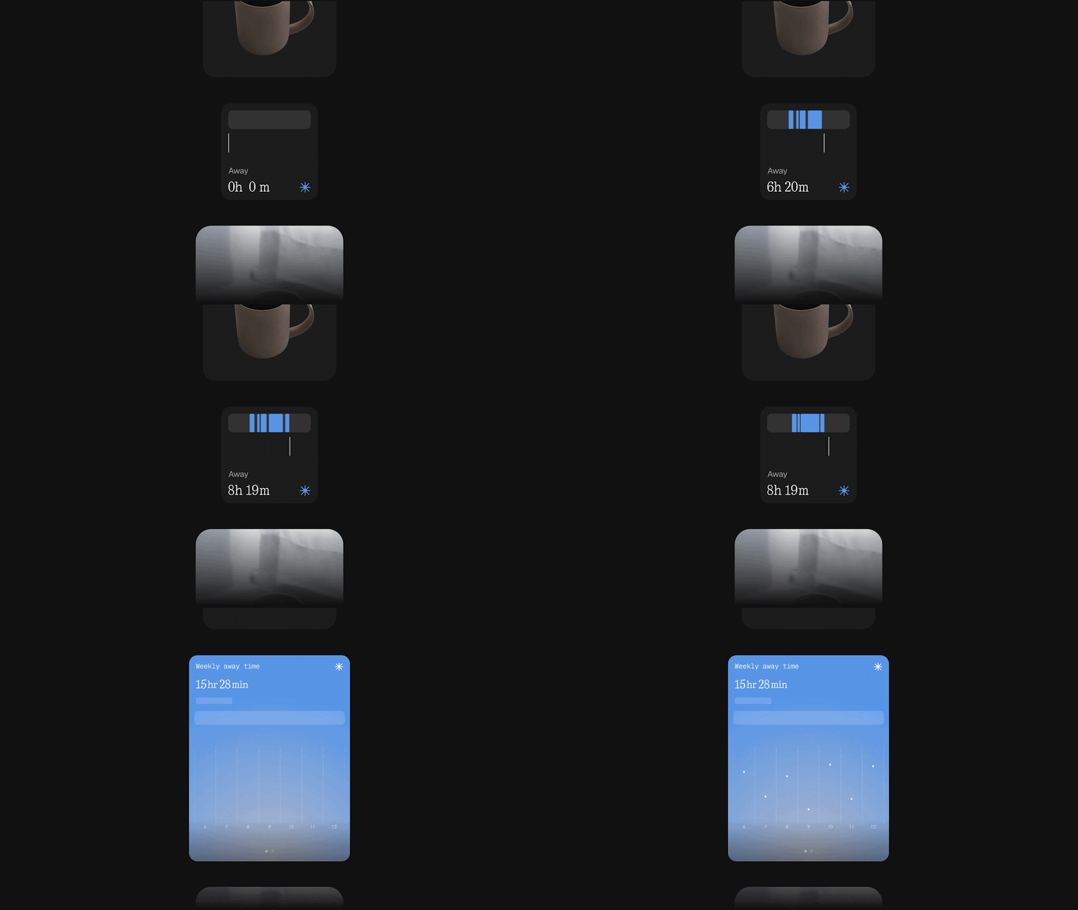
While typical digital wellbeing tools feel like a digital scolding, the "Away Time" widget focuses on the "gamification of absence." It tracks your longest breaks and weekly screen-off patterns, rewarding the time you spend disconnected.
This "anti-screen time" approach is beautifully counter-intuitive for a hardware company. It reinforces Nothing’s core philosophy: technology should be intentional, not addictive, by celebrating the void rather than the engagement.
The Great UI Divorce: A Study in Physics and Haptics

Nothing OS 5.0 introduces the "Great Divorce" of the Notifications and Quick Settings panels. Following a trend seen in iOS and MIUI, a swipe from the left reveals notifications, while a swipe from the right pulls down a dedicated settings space.
The UI/UX triumph here is in the physics; the panels feature a "curtain-like" transition and bouncy animations that drop with a satisfying shake at the end of the gesture. Nothing has even tweaked the layout to be more intentional, placing the brightness slider on the left and volume on the right to differentiate its aesthetic from direct clones.
Lucent Aesthetics and the Transparency Paradox

The new "Lucent" theme (affectionately dubbed "Flucent" by some) pushes a glass-like layering across folders and widgets. This is paired with the new "Geist" typeface, which replaces "Inter" to offer a more distinct, terminal-inspired character that balances clarity with brand personality.
However, as a critic, I must point out the "Transparency Paradox." While widgets and the Gallery embrace this beautiful translucency, the Control Center remains stubbornly solid, creating a visual inconsistency that makes the "Lucent" overhaul feel slightly unfinished.
"Geist helps us balance clarity, character, and consistency across the system." — Nothing Community Post
Technical Depth: Privacy UI and Android 17 Nuances

Nothing has cleverly integrated Android 17’s new three-color privacy indicator system in the status bar. A green icon now signals sensitive sensor access, blue indicates location tracking, and a new yellow indicator appears specifically for AI data processing.
The update also includes delightful platform-level refinements, such as Noto 3D emojis and an independent volume slider for the Assistant. These small touches, combined with a smaller navigation bar and redesigned Bluetooth controls, make the system feel significantly more modern.
The Bitter Pill: A Rollout of Progress and Abandonment
The rollout begins with the Phone (3) Open Beta on August 26, with a mid-October general release. Other devices like the Phone (4a) Pro, Phone (3a), and the upcoming Phone (4b) will receive the update through late 2026 and early 2027.
The "bitter pill" for the community is the hard cutoff for original hardware. Owners of the Phone (1), CMF Phone 1, and most notably the Phone (2) are being left behind. For the Phone (2) to lose major platform support just two years after its flagship launch is a controversial move that risks alienating the brand's early adopters.
Conclusion: More Than Nothing?
Nothing OS 5.0 is the most significant evolution in the company’s history, moving from "look at me" hardware to "work with me" software. It transforms the smartphone from a passive window into a tool for user-led creation and intentional disconnection.
The question for the user has shifted: Do you want a phone that simply gets out of your way, or do you want a device that finally gives you the tools to build your own experience?
Comments
Post a Comment