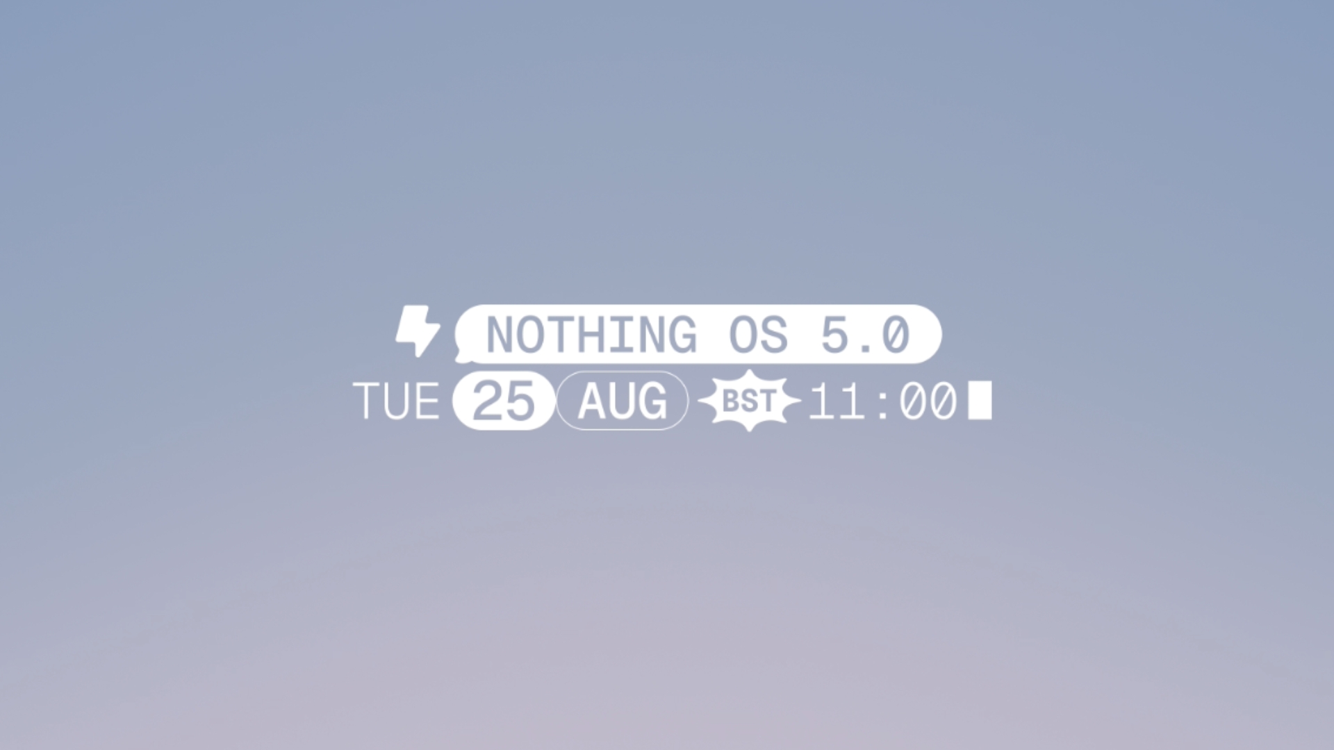
Nothing has carved out a unique niche in the crowded smartphone market by leaning heavily into a "less is more" philosophy. From its glyph-laden hardware to its dot-matrix aesthetic, the brand has built its reputation on minimalism. However, as the company prepares for the official launch of Nothing OS 5.0 on August 25 at 11:00 BST, the stakes have shifted. The upcoming reveal represents a pivotal moment for the London-based tech firm: can Nothing balance its signature "cool factor"—that elusive mix of niche design and hype—with the functional, robust demands of a mature operating system? Early teasers suggest a shift from simple stock Android purism toward a more visually ambitious and feature-rich identity. Here are five ways Nothing OS 5.0 is set to redefine the user experience.
1. The End of the "Unified Shade" Era
One of the most significant functional shifts in Nothing OS 5.0 is the departure from the "unified shade" layout. For years, Nothing remained a holdout, mirroring the stock Pixel UI by keeping notifications and system toggles in a single combined panel. That changes with OS 5.0 as the update introduces a dual-panel setup where users swipe down from the left side of the status bar for notifications and the right side for Quick Settings. While Nothing claims this provides "faster access" to essential toggles, a UX critic must note the inherent friction. Moving away from a unified shade complicates one-handed use, requiring a more deliberate, precise gesture than the traditional layout. It is a clear sign that Nothing is ready to prioritize industry-standard efficiency, seen in competitors like HyperOS and iOS, over the effortless but crowded stock Android approach.
2. The Return of Skeuomorphic Charm?
In a digital landscape dominated by flat, clinical design, Nothing is looking to the past to inject personality into its interface. A recently teased airplane mode animation has caught attention for its tactile playfulness. When activated, the interface plays a distinctive transition that feels remarkably human compared to the sterile "Material You" transitions found elsewhere. This move has drawn immediate comparisons to the skeuomorphic animations of Apple’s iOS 6, providing better "affordance" by making the digital state-change feel physically grounded. It is a move that validates Carl Pei’s design-centric leadership.
"The details are not details. They make the design."
By reviving a decade-old concept, Nothing is making a statement: small, ostensibly unnecessary animations are what transform a utility into an identity.
3. Building on the Bleeding Edge: Android 17
Perhaps the most ambitious technical aspect of Nothing OS 5.0 is its foundation. This update is built on Android 17, making it one of the most forward-looking software leaps the company has attempted. Evidence of this new design language has already surfaced via the Nothing Gallery beta, where we have seen a dedicated HDR display toggle and the implementation of live blur behind the navigation bar. These under-the-hood enhancements suggest that OS 5.0 is not merely a skin, but a deep integration with the latest Android capabilities. It is a necessary move; Nothing has occasionally lagged behind rivals like One UI in animation smoothness, and an Android 17 foundation provides the technical headroom to finally close that gap.
4. More Than a Font: A Complete Aesthetic Overhaul
Nothing is doubling down on its bespoke visual language, moving further away from standard "Roboto" fonts to create a more tech-forward aesthetic. A key component is the introduction of the Geist Mono font, though as a critic, I must note a point of ambiguity: while Geist Mono appears in recent design mockups and recordings, the default Roboto font is still visible in other system screenshots, suggesting the overhaul may not be as total as the hype suggests. Beyond the typography, the refresh is granular. The status bar features a redesigned battery icon—replacing the version only recently introduced in OS 4—and volume sliders have been modernized for a more cohesive look. The Gallery app showcases the new direction with redesigned Explore and Albums pages featuring rounded, distinctly-bordered cards, while the OS more broadly introduces expanded lock-screen clock customization and icon-rich context menus that replace the plain text lists of OS 4.1.
5. The Growing Pains of Hardware Cycles
With rapid software innovation comes the bitter pill of hardware obsolescence. As Nothing OS 5.0 pushes the envelope, the reality of the brand's hardware lifecycle is coming into sharp, uncomfortable focus. Nothing has indicated that the Phone 1, Phone 2, and CMF Phone 1 will not receive the update to OS 5.0 as they have reached "end-of-life" status. This is a staggering realization for a company that markets itself as a community-first disruptor; the Phone 2 and CMF Phone 1 are relatively young devices by industry standards. While the upcoming Phone 3 and Phone 4a series will lead the beta rollout, one must question the sustainability of a brand that moves so quickly to orphan its early adopters. It is a stark trade-off: Nothing is innovating at breakneck speed, but the longevity of its hardware seems sacrificed at the altar of software hype.
Conclusion
Nothing OS 5.0 represents a significant turning point. It is the moment the brand moves from being a minimalist curiosity to a visually ambitious competitor that isn't afraid to borrow successful elements from its rivals while maintaining its own unique, skeuomorphic flair. As we look toward the full reveal on August 25, a fundamental question remains for the community: do you prefer the "pure," lean experience of stock Android, or is Nothing’s move toward a highly stylized, feature-rich, and proprietary direction exactly what the ecosystem needs to stay exciting?
Comments
Post a Comment